Text
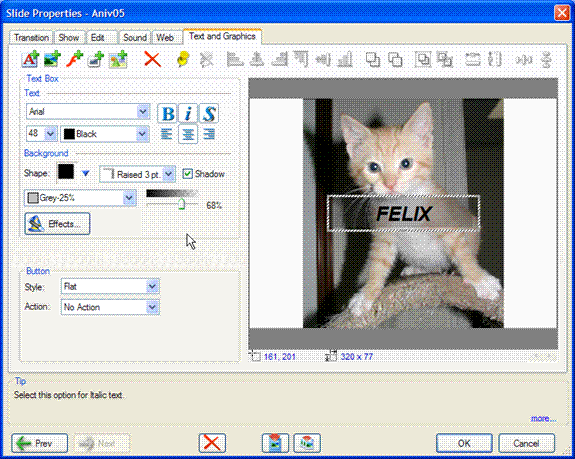
 Selecting the Add Text (replaces Label tab from older versions) icon brings up the Text Box panel in the Text and Graphics tab as shown below.

Text Tab
To add a text label click on Text icon. A text entry box will appear. The box may be moved or resized.
Click on the text icon to add all subsequent text boxes. all attributes of the previous text box are continued in the correct text box.
The Text tab is shown above.

Text selection dialog.
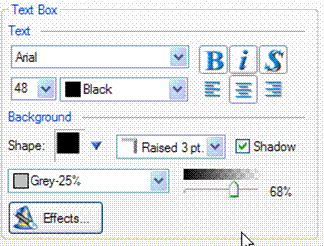
The Text Box panel provides for the selection of the attributes of the text to be added.
The Text drop-down menu provides a list of all True Type fonts available on the PC. You should expect to see dozens of selections when this drop-down menu is selected. These fonts are provided with your Windows operating system.
To select a desired typeface click on the Text drop-down menu and then click on the type face you wish to use. As soon as a typeface is selected all the text in the current Text object is changed. The drop-down menu provides a selection of standard typeface sizes. Click on a size to select it ,all the text in the current box will be to be changed to that size. The typeface size may also be typed into the Text Size box and may be an size up 99 points.
The Color drop-down menu selects the text color from a standard list of colors, textures and gradients.The last value, Custom provides access to a standard color selection dialog that provides for creation and saving and selection of any of the available 16+ million colors supported by 24 bit images.
Bold, Italics and Drop Shadow buttons choices which are applied to all the text in the selected box The Drop Shadow creates an anti-aliased (blended) outline that adds visibility to the text over complex backgrounds. This is highly recommended for video output.
The Align icons provide justification for the text within the current text box.
The Background panel provides for the selection an optional text background and its properties.
The Text Color drop down menu provides standard color, texture and background selection for the the background object. The Transparency slider controls the transparency of text backgrounds.
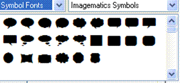
 The Shape drop down box inputs any shape stored on your PC for us as a backgrounds. Your first choice will be a custom Shape set created by ImageMatics
The left pull down box lets you pick among Symbol fonts suck as ours or with other common fonts you may have on your PC such as Wing Dings and webdings. Literally thousands of font and symbol sets may be found on the Internet.
See the section on Symbols for more information.
The selected shape becomes the background for text box providing the building blocks for call outs, narration bubbles and banners.
The effects box next to the Shape menu provides for the addition of bevels of different appearances.
Checking the Shadow box adds a drop shadow to the created shape.
the Shape box is the color selection for the background. This is a standard color selection dialog.
The Transparency slider controls the transparency of the text box back ground. The text itself remains opaque.
The box size may be modified by moving the cursor over the blue "tic" marks on the border line. The cursor shape will change to an up down arrow or a side to side arrow indicating that the line has been selected for editing. Hold the left mouse button down and pull the selected side to the desired position.
The box may be moved anywhere over the image. Move the cursor to an unmarked portion of the text box border. The cursor shape will change to four arrows pointing out. Hold down the left mouse button and drag the text box to the desired position.
To add additional text boxes click on the Text icon again, this will bring up a new text box with all the attributes of the one just created.
To delete a text box move the mouse over it and select it with the left mouse button. The click on the red "X" and it is deleted.
Clicking on the Effects button brings up the Effects dialog common to all Text and graphics object types. The dialog controls the entry and exit animation of the selected text box and its timing. (see section on Effects dialog)
Any Text object can be converted to a button (as can all Text and Graphics object types) by adding a Style and an Action. See section on Buttons

